Multimedia E-books: Immersive or Subversive?

15 04 2012

It’s a troubling, even agonizing, question: How will authors who are crafters of text cope with the new era of multimedia e-books? For me, three recent articles brought that question into greater focus:

Knapp’s and Wattercutter’s articles cover how publishers are aggressively launching e-books as multimedia apps. Knapp cites three as exemplars of the features of multimedia e-books:

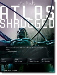
  • NAL’s “amplified” edition of Atlas Shrugged, which besides text Atlas Shrugged screenshotcontains video and audio of Rand, personal letters, original manuscript pages and notes, an illustrated timeline of author’s life and works, and an interactive quiz. The e-book also allows readers to share passages with others.
  • The narrated and interactive children’s book The Gift
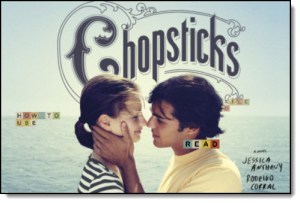
  • The “novel” Chopsticks, which is the most non-linear of the three. It’s not a narrative story, but a collection of newspaper clippings, songs, and other paraphernalia that together paint a picture of a teenaged pianist and the boy next door.

A fourth example, The World of Richelle Mead, is not even a book, but a “free community powered, enhanced e-reading experience.” It’s more of a social media platform by which readers can buy the author’s books and interact with the author and each other.

Knapp quotes producers and authors both pro and con on the value of such e-books. For example, he quotes multimedia e-book producer Ian Karr as saying “Just as there can be stream of consciousness in writing, there can be a ‘stream of literacy’ in reading, where reading one thing lights the fire to start something new. The bottom line is just providing that richer experience.”

On the other hand, author Jay Bell declares “The more I think about it though, the more these ‘enhancements’ are probably too intrusive and will potentially get in the way of the story.”

And multimedia e-book author Andrea J. Buchanan declares in Knapp’s article “First and foremost, I’m a reader . . . So I want an immersive experience. As a writer, I was really conscious of respecting that. I didn’t want to put stuff in there because I could—I wanted to support and enhance the story.”
ChopsticksIn the most radical view of e-books, Wattercutter quotes e-book publisher Panio Gianopoulos as envisioning a far more social experience. Writes Wattercutter,

For instance, secret chapters could be unlocked as a person’s friends read a book. [Gianopoulos] foresees readers using a reddit-like model to up-vote characters or storylines they enjoy, or publishers forming partnerships with Foursquare that could reveal clues to readers who check in at certain locations. “Multimedia is more than a tie-in—done right it becomes a new kind of product entirely, a hybrid of book and film, or Facebook page and TV show, or something no one else has even thought of yet. . .

However, in a powerful argument for the preeminent value of text, Paul’s New York Times article reveals why unadorned prose is such a powerful medium. She reports studies of the effects of reading on brain activity, as measured by functional magnetic resonance imaging (fMRI) scans of readers’ brains. The researchers found that reading a text narrative activates not only the language regions of the brain. It also activates sensory-processing regions associated with the description being read. For example, reading descriptions of odors activates the olfactory cortex; and descriptions of textures activates the region that processes touch sensation. Similarly, descriptions of motion or activity stimulate the motor cortex that processes movements such as grasping and running.

Paul also cites fMRI studies showing that the “reading brain” treats scenes of characters interacting as if the reader was experiencing those interactions.

To me, these findings strongly suggest that integrating video, audio and interaction into e-books may not be immersive—keeping the reader engaged in a story. Rather, they might be subversive—distracting readers from the rich internal world that prose can construct within the reader’s mind.

I contend that prose has an “idea density” that video and audio do not. I also believe that prose has an “emotional density” that can be more deeply affecting than that of visual media. My ten-year-old granddaughter’s deep love of reading offers an excellent example of the lure of prose. She becomes so engrossed in text that she reads books while walking and must be guided to avoid lampposts and fellow pedestrians. When I watch her read, I see a young mind totally immersed in the realm of the written word. E-books’ interactivity, sound tracks, and video, it seems to me, would distract from that engagement.

I also worry that interactive children’s books such as The Gift will compromise teaching The Giftchildren to love reading. The interactive process might distract from the warm, intimate environment created when a parent (or grandparent!) reads to a child—an environment that will form a deep-seated enjoyment of reading.

I’m not arguing that multimedia e-books have no place in publishing. The added features of the amplified Atlas Shrugged do not intrude on the prose and offer new pathways for exploring the book’s history. And clearly, video and animation could enhance how-to books and textbooks.

But to repeat the question raised at the beginning of this post, how should authors cope with the issue, some would say specter, of multimedia e-books?

It’s an immediate issue for me, because I’m involved with both fiction and non-fiction projects. One of my science fiction novels is now under consideration by a commercial publisher. And I’m co-authoring a non-fiction book—tentatively titled Mysterious Baby—with my daughter, emergency room pediatrician Dr. Wendy Hunter, on the exotic physiology of infants.

So as a fiction author, should I offer publishers music and sound effects to accompany my book, as produced by the Booktrack service? Should I develop links to videos or background about my characters, the novel’s setting, or the technology it depicts? My current position is that I will ignore creating such content. I will concentrate solely on making the written story as compelling and rich as possible. If the publisher wants multimedia for the e-book version, a rather intense negotiation will ensue.

On the other hand, the Mysterious Baby nonfiction book might represent a stronger case for such multimedia. For example, parents might be greatly relieved by seeing video of a newborn in the throes of  harmless-but-scary involuntary jitters called benign myoclonus. It’s no more dangerous than hiccups, and seeing such a video might make it less likely that parents will rush their jittery baby to the emergency room.

But in writing this nonfiction book, I will also ignore the eventuality that it may become a multimedia e-book. Given the cost of such productions, the doubtful profitability of multimedia e-books, and the turmoil of constantly evolving e-book formats and readers, for now I’ll concentrate on writing, thank you very much.




Use Infographics to Explain Your Work

2 12 2011

Creating dramatic infographics—visually compelling charts and graphs—is not as daunting as it might seem. By following some basic guidelines you can develop infographics that illustrate your research in a way that grabs the attention of both lay and professional audiences.

These tips aim to guide you in producing an infographic that engagingly conveys your concepts using images and words. They have been distilled from the extensive list of how-to web sites at the end of this post. The sites are roughly in the order I found them most helpful. Besides infographics, these tips can also help you develop more effective charts, graphs and diagrams.

Why create an infographic?

To convey basic data , all you really need are simple charts, graphs and diagrams—although you can also make these more attractive with graphics. But true infographics aim to explain more complex concepts, and in a visual, easily scannable and digestible form. They resonate with our visual communication culture, and their visual nature helps overcome literacy and language barriers.

Also, because infographics can be entertaining as well as informative, they attract attention to your work. People tend to share them and link to them on your web site, widening your audience. Adding an infographic to a news release about your work makes it easier for reporters to understand, and media may use or adapt the infographic for an article or web site.

Infographics can range from static images to animated slide shows and videos. They can also range from simple infographics you can produce yourself to those designed by a professional artist. For an in-depth overview of infographics and their history see this Wikipedia article on infographics.

As illustrated by this list of infographics, the best are creative, informative, graphically well organized and often use humor or whimsy:

In contrast, here are a few that I think don’t work:

With these examples in mind, here are steps you can take to create an engaging infographic. Once you’ve gone through them, you might go back and review the examples, and judge which ones you think meet the criteria for good infographics.

What’s your audience?

Most infographics aim at lay audiences, but there are many levels of lay audiences, from science buffs to students or laypeople who know little of science. Similarly, professional audiences may range from students new to the field to established scientists. So, start by deciding the audience at which you will aim your content. Also plan your style accordingly. A lay-level infographic would be more light-hearted, even humorous in style, while a professional-level infographic would be more serious.

Do you really need an infographic?

An infographic should tell a story. It could portray

  • the interrelationships in time or space among elements of a concept
  • a flowchart of a process
  • a visual timeline, for example tracing the evolution of a concept or industry

You don’t need an infographic if you only want to display a collection of data. Instead, a well-designed list or chart might suffice. For example, to me, these Twitter infographics might just as well be lists or simple graphs or charts. Tricking them out as fancy infographics only makes their data more difficult to grasp.

An infographic can also tell your personal story, as a visual resume or life history. If you are a scientist, it can not only visually explain your work and goals , but also display your communication skills. Two good tools for such infographics are the services Re.vu  and Visualize.me, which enable users to import LinkedIn profile information to create an infographic web page profile. The profile can include a broad range of information on your career history, skills and goals. Of course, such resumes could be considered gimmicks, so use them only to the extent that they usefully portray your work and history.

Informational or editorial?

Your infographic could aim only at providing useful information. For example, a how-to infographic might be adapted as a wall poster. And an infographic that shows the sides of a debate will also grab attention. But if you are seeking media coverage as well as attention, your infographic should be an editorial—illustrating your position on a controversial topic. It should be newsworthy, timely, interesting, surprising, opinionated, thought-provoking and/or contrarian. The examples in the list above show both kinds.

Do lots of research!

While you may have plenty of information on your topic, nevertheless check out a wide range of other sources. This research ensures you have all the information—including not only basic facts, but the opinions and theories of others in your field. For scientific topics you could explore Scientific American, Science News, EurekAlert! and Newswise. ThisExplaining Research reference page lists many web content sources that can offer background information for your infographic. To research a broad range of topics beyond science, use Google, Wikipedia and other such search sites. You’ll want to cite these sources in your infographic, to give it credibility.

Chart your points and organize design

Once you’ve gathered your data, write out the points you’ll want to make, and the supporting text. Keep the text extremely brief. Remember, you’re telling your story with graphics as well as text. Your intro should be emphatic but brief, your explanatory text punchy and your supporting statistics simple and dramatic.

Next, sketch out the visual flow of your infographic—how your points might be organized in two dimensions. Also, consider whether you want your infographic to be a literal representation of your topic, or metaphorical. For example, this history of driving in America uses a board game metaphor. Such metaphors will engage viewers and make your infographic fun—if that is the appropriate tone you want. Obviously, for a more serious topic you wouldn’t want such a whimsical design. For a serious or controversial topic, you would want a straightforward design. Color also affects tone, with dark colors implying status and prestige, and bright colors such as yellow being friendlier. For a more extensive discussion of such design tips, see this blog post by Gracie Lavigne.

Include your brand in your design, but unobtrusively so as not to make your infographic look like an ad. This brand should include your web site URL.

Your design should take into account the right size for your infographic. If the infographic will be a vertical, keep it to 1,000 pixels wide and try to keep it no longer than 10,000 pixels; if it is to be a horizontal, make it no taller than 700 pixels. This ensures that users will only have to scroll in one direction, rather than both as with this infographic.

Do you want a video animated infographic?

A video animated infographic combines audio and animated visuals, either video or slides. As a video, it can be posted on YouTube; and as a narrated slide show or video on such sites as Mybrainshark, Slideshare or Slideboom—which also enable you to embed the infographic in your site. Consider creating such an infographic if your topic will really benefit from audio and animation—and if you have the resources. Such video infographics have high impact and will likely be linked to and Tweeted widely. Here’s a good tutorial on video infographics, and for good examples, see this collection of animated infographics and this extraordinary NPR video infographic on how a population grows to seven billion.

Hire a designer, or do it yourself?

For a really elaborate, polished infographic, hire a designer who knows sophisticated design software such as Adobe Illustrator and Photoshop. According to this excellent article on how to find an infographic design agency, the cost should be no more than $1,000.

Your designer should be able to take your text and rough design ideas—and undoubtedly come up with new ideas—and deliver quality designs. Here’s a good article that described what your designer is looking for. The service visual.ly offers experts who can create infographics for you.

However, you can do your own infographic, if you’re willing to learn some basic software. The web site Visme offers whatVisme looks like an easy-to-use system for creating your own infographics. And here is an article from Visme on how to organize your infographic.  Here are other programs that enable basic do-it-yourself infographics, diagrams, flowcharts, maps and image processing:

These tools are among those discussed in this article on tools for making your own infographics.

Whether you use a designer or do it yourself, test your draft infographic on representatives of your audience to make sure it works. One test whether it communicates easily and immediately is to let them look at it for about ten seconds, and see if they are intrigued and get the general idea.

Market your infographic

Once it’s done, of course, you will post your infographic on your web site and/or blog and Tweet about it. But there are other steps you can take to get attention. Send out a news release to media and relevant bloggers about your infographic. And if your infographic illustrates a news release, make sure the link to the infographic is prominently displayed within the release. Send an e-mail blast to lists of people and institutions that will be interested in your infographic.

Beyond these steps, this article on how to market an infographic contains other excellent recommendations for marketing your infographic—for example, including a copy-and-paste embed code, adding buttons for social media sharing (e.g. Facebook, Google+, Twitter), and submitting it to article-sharing sites (e.g. Digg, Stumbleupon, Reddit).

Finally, here is a large collection of helpful tutorials on creating infographics, including those I drew on for this post:


Cool Tools for Communication

8 09 2010

The Web is bringing a constant cascade of tools for communicating. Here’s a roundup of new—or at least new to me—tools for designing  and sharing PowerPoint presentations, making snazzy charts and videos, collaborating over the Web, and creating interactive Web pages.

Links to these sites and many more are also listed in the Explaining Research References & Resources for the chapter on presentations.

In creating PowerPoint presentations, you can escape the stodgy world of standard templates by downloading more dynamic video backgrounds and animated and 3D templates from sites like a Luna Blue, 123PPT.comAnimation Factory, CrystalGraphics, and PoweredTemplates. While most of these wouldn’t be appropriate for professional or technical presentations, they could be very effective for grabbing lay audiences.

For sharing narrated “slidecasts” of PowerPoint presentations, I’ve previously been a fan of Slideshare. However, I’ve since switched to Slideboom because of its greater flexibility and capability. The problem in creating a slidecast with Slideshare is that it requires you to upload a separate audio file and go through a laborious synchronization process. In contrast, Slideboom uses PowerPoint’s built-in capability of adding narration to each slide. Thus, you can tweak your narration of each slide, without having to read through an entire script at once. And synchronization of audio and slides is automatic. Slideboom also allows integration of video and animation into slidecasts. Here’s an example of a Slideboom slidecast I produced that includes video and animation.

Another intriguing presentation tool is 280Slides, which enables creation and sharing of presentations online. Presentations can also be downloaded to PowerPoint to be delivered live.

For creating videos,the flashy music videos that the Animoto service can generate might not be appropriate for a scientific symposium. But they could prove compelling for exhibit displays and for lay audiences ranging from school groups to donors. Using one of Animoto’s many themes, you can create videos automatically from your photos, video clips, and music. Check out the Animoto showcase of education videos for examples.

Lovely Charts could prove a godsend for those who struggle with creating charts and diagrams. The Web-based application uses a simple drag-and-drop drawing mechanism to design and organize flowcharts, sitemaps, organization charts, wireframes, and other such visuals. Check out the Lovely Charts gallery for ideas.

I’ve long been a fan of Snagit for capturing and editing Web pages, images, and video. Now, Snagit has a new version that I also recommend. My favorite feature is the updated magnifier that makes captures more precise, but there are many other new features.

For sharing files across the Web, many people are fans of Google Docs, but it has limitations. For one thing, you’re limited to Google’s software. A more convenient file-sharing service is DropBox, which creates DropBox logovirtual folders on your computer that you can access anywhere and share with anyone you designate. These folders can hold any kind of file, and folders on each computer are automatically synched with one another. You can store 2 gigabytes of files for free, and pay a modest monthly fee for larger capacities.

For capturing, organizing, and sharing Web sites, video, audio, images, and documents, I have found Evernote to be a highly useful system. Such materials can be loaded onto Evernote, tagged with custom labels, and shared with others on the Web. Here’s a video demo of the system.

I’ve saved the most important new communication tool—the new hypertext markup language HTML5—for last. It’s a major revision of HTML, enabling creation of interactive Web pages that will offer important new communication capabilities. One simple example is this interactive YouTube advertisement for Tipp-Ex text eraser (warning: some rough language). It lets the viewer enter instructions for what a comical hunter does to a marauding bear. A more mind-blowing demonstration is this interactive film The Wilderness Downtown. To start the film, the viewer first enters his/her childhood address, and HTML5 enables the film to create a custom video showing Google Street View images from the neighborhood. The video creates a variety of popups during its run, and the viewer is even asked to write a letter to his/her childhood self. While HTML5 is certainly not amenable to programming by the novice, it’s interactive capabilities offer a powerful new Web communication tool.


Communicating Research in 3-D Virtual Worlds

5 03 2010

Today you write news releases and feature stories, produce videos and podcasts, and use social media to disseminate research news; but in the near future you could also add 3-D models, interactive simulations, and immersive virtual environments to your communications toolkit. Given that we humans are naturally perceptually three-dimensional, you can imagine how such media could add to the impact and information value of your communications.

The major force driving communications into an online 3-D world is that important audiences are already there. For one thing, a survey by the Pew Internet & American Life Project found that more Americans already get their news online than from newspapers or radio, although both still lag behind television. And another survey showed that more than half of all Americans play video games of some kind, undoubtedly in 3-D.

The education community is already using immersive Web environments, adapting existing 3-D interactive virtual worlds such as Second Life; and there are extensive materials on use of Second Life in education. Basically, the environment enables students to attend virtual lectures, move around in the cartoonlike world as avatars, and communicate with one another—frankly capabilities that don’t seem to add much value to the educational experience. Indeed, “the virtual world has not lived up to the hype,” writes Jeffrey Young in a critical article in the Chronicle of Higher Education. He reports that

Moving around in Second Life can be so clunky that some professors and students have decided that it’s just not worth the hassle …. If all you need to do is chat with far-flung students, there are many easier ways to do it…. Plus, a lot of decidedly nonacademic activity goes on in Second Life, and it’s difficult to limit access so that only students can enter a classroom there.

And while there is a new project called OpenSimulator that aims to improve educational uses of immersive environments, it still does not offer particularly new interactive capabilities.

Writes Young, “It turns out that virtual worlds are at their best when they look nothing like a traditional campus. Professors are finding that they can stage medical simulations, guide students through the inside of cell structures, or pre­sent other imaginative teaching exercises that cannot be done in a physical classroom.”

This promise could be realized by a new flexible open-source system called OpenCobalt. Watch the video below for an introduction:

As the video shows, the OpenCobalt environment enables users not only to naturally interact and collaborate with each other and with traditional videos and Web pages; it also enables them to play with 3-D objects and simulations in an engaging and informative way.

Users of OpenCobalt will not be limited to the usual keyboard and mouse, but can also interact with the environment using multitouch screens, as this video illustrates. To me at least, the authoring system —as illustrated in this video—is intuitive enough that designers can master it well enough to work with communicators to create effective interactive environments and other products.

“Wonderful stuff can happen when you move away from the page metaphor,” asserts Duke researcher Lombardi, one of OpenCobalt’s architects, in an article on the Duke Research blog. “We’re living in a 3-D world. We need to interact with each other and with information in 3-D spaces.”

Certainly, such immersive environment platforms as OpenCobalt are still in their infancy. And, there is an element of trendiness that leads Young to comment that “Maybe 3-D online environments are just one of those technologies that sound cool but never fully materialize, like personal jetpacks.”

But there does seem to be legitimate communications value in such 3-D interactivity. And, of course its flashiness can attract eyeballs. So, it’s not too early to at least begin considering how to use virtual environments to not only communicate research more effectively, but make your communications stand out in the tidal wave of information inundating today’s Web.


Duke Lemur Center “Path to Tomorrow” Project: Premier Example of Effective Communications

2 03 2010

The Duke Lemur Center is a contender in the Pepsi Refresh contest, in which Pepsi awards $50,000 to the most popular projects aimed at making a positive difference. The Lemur Center’s “Path to Tomorrow” project description page on the Pepsi site represents an excellent example of how to create compelling communications on a limited budget. First of all, there’s the video, produced by the Center’s advancement officer Lari Hatley and her videographer husband Jeff:

The video combines basic techniques—simple panned-and zoomed still images, punchy text, dramatic music, and stock footage—to create a memorable, moving message. The video illustrates vividly how ingenuity is the most valuable asset in creating good communications.

Then there’s the page’s descriptive text, which is concise and compelling. For example, the title is a simple, effective statement that the project aims to “Save lemurs by growing public awareness through a new tour path.” Notice how the very first words are “Save lemurs,” which is a grabber phrase—a lesson that should be heeded by any communicator faced with writing a headline.

And the bullet points for the goals also grab readers and inspire them to action:

  • To increase the number of guests to the Center by 50 percent
  • To create an inspiring tour path easily accessible to all guests
  • To build four additional state-of-the-art outdoor animal habitats
  • To prevent the extinction of more than 70 species of lemurs
  • To use lemurs to enlighten guests about all endangered animals

Finally, the Lemur Center description introduces the center in a highly engaging way, using words that captivate readers and describe the Center’s mission in human-centered terms:

For more than 40 years, the Duke Lemur Center has been a safe place for lemurs. Today we learn from and care for more than 200 endangered animals, and we share our passion for lemurs with guests. By creating awareness, we hope to inspire a future generation that will learn from and care for lemurs.

All-in-all, an excellent, instructive communications package.

And now for a confession/commercial: I’m an avid supporter of the Lemur Center, and I urge you to go to the Center’s project page and vote for their Path to Tomorrow project. And do it every day until the end of March!


AAAS Slidecast: Using Multimedia to Advance Your Research

21 02 2010

Here’s the narrated slidecast of my presentation “Using Multimedia to Advance Your Research,” given at the 2010 meeting of the American Association for the Advancement of Science. Besides the slidecast itself, I offer tips I learned to producing better slidecasts from your PowerPoint presentations.

Using Multimedia to Advance Your Research

In creating the slidecast from my PowerPoint slides, I realized that I couldn’t just record the live session and use that as the audio narration. Live sessions include noise, interruptions, audience questions and other extraneous audio that reduce the effectiveness of the slidecast.

So, I had to do a special narration in a quiet room, using a standard digital recorder. Then I could upload that as an mp3 file and synch it to the slides. However, I also discovered that I coudn’t just exemporize my narration. Such an off-the-cuff narration — complete with pauses, stammers, and uhs — comes across as less than professional. So, I had to write out a formal script and recite it as the narration. Scripting actually helped my live presentation, because it crystallized my phrases and made the presentation smoother.

Also, unlike the live presentation, SlideShare presentations do not allow embedded video. So, for the slidecast I substituted still images of the videos with links to the video on YouTube or other sites. Which brings up an advantage of doing a Slideshare slidecast: that you can embed both text and image links in the slidecast, so users can explore the sites you discuss.

If you do a lot of slidecasts, you might also take advantage of Slideshare’s new branded channel feature, which enables you to produce branded channels.

I should emphasize that Slideshare is by no means the only game in town. There are also myBrainShark, Slideboom, and authorStream. In fact, according to this review of slide-sharing sites, they are superior to Slideshare. For example, myBrainshark enables uploading of narrations via telephone. And, you can add images, video, and quiz questions. So, I will likely be migrating my slidecasts to myBrainshark in the future. See the reference section of Explaining Research for a full list of such sites and resources.

Finally, here’s a whitepaper that covers the use of lecture capture technology in academe, which concludes that that

Lecture capture now falls into the “need-to-have” category. The relatively new breed of lecture capture solutions, which refers to any technology that allows instructors or presenters to record what happens in their lecture hall and make it available digitally, is changing how higher education thinks about technology while also changing the competitive landscape.

Although  the whitepaper covers much broader issues than just slidecasting your own PowerPoint presentations, it does show that you’ll likely be doing yourself a favor by learning to use slidecasting technology.


Snagit: a Great Tool for Screen Captures

30 01 2010

If you’ve done screen captures like I’ve done in the past, you probably just hit the “Print Screen” button (PrtScrn) to copy the whole screen to your clipboard, then inserted it into your presentation or document. Or, maybe you used the simple snipping tool in Windows Vista and Windows 7.

But now that I’ve discovered Snagit that’s all changed. It’s an incredibly useful piece of software for selectively lifting  all or part of a Web page or other screen segment and sending it to Excel, Word, PowerPoint, e-mail, or just about any other program. You  can capture images, text, screen video and even a Web page, complete with active links. In fact, I usedSnagit home page graphic Snagit to capture the image of the Snagit home page graphic on this post. You can even record animated sequences of interactions with a Web page, showing cursor movement and the effects of clicking on links.

When I created a recent PowerPoint presentation, I used Snagit to record such an interaction, as well as capturing and editing logos, selective chunks of Web page and other visuals to make my PowerPoint presentation look much more professional. You can also add arrows, speech bubbles, labels and other explanatory elements to the captured images. And if you want to emphasize a particular section of a Web page, you can even blur out the whole Web page except for that section.

Try the free 30-day trial. I can just about guarantee you’ll end up buying it. At $49.95, it’s a bargain. I should add that there are other screen capture programs out there, including  CaptureXT, CaptureWizProFastStone, and !Quick Screen Capture. They may work well, too, but I chose Snagit because it received the best reviews.


Create Screensavers to Show off Your Visuals

25 11 2009

It dawned on me that I forgot to include in the book a terrific use for research images: in screensavers. Not only will a screensaver show off your images and video on your own computers, but your audiences can download it to run on their machines. If you have a Windows computer, you can create a simple screensaver on your own machines  using the Personalize feature. Just right click on the desktop, click on Personalize, choose the Screen Saver option, and choose the Photos option for your screensaver. You can then designate which photos to use.

Of course, this method creates only a basic slide show, and you can’t offer it for download. You can produce more elaborate downloadable screensavers using such commercial software as Screensaver Factory, Screensaver Maker, Screentime, Ultra Screen Saver Maker, or iEasy Screensaver Station. There are many more programs out there. Just do a Google search for “screensaver software” or check out CNet’s screensaver listings to find one that fits your needs.

These software packages enable you to create screensavers using images, video, and Flash animations, and even add interactivity. Some of the more advanced software might be complicated to use, however, so you might want to enlist or dragoon a programmer to produce more elaborate screensavers.

Your screensavers can use not only your own images and videos, but those from other sources, with appropriate permission and credit, of course. For example, an astronomy screensaver could use Hubble telescope images of the objects you study; or a structural engineering screensaver could show examples of the bridges that illustrate the principles behind your work. Think visually!

Even simpler than screensavers are wallpaper images. For example, National Geographic offers a huge collection of its elegant images as wallpaper. Like them, you would have to offer your images in two sizes–800×600 pixels for smaller monitors and 1024×768 pixels for medium-sized monitors. National Geographic also offers larger images of entrants in its photo competition as wallpaper.

When creating your screensavers or wallpaper images, don’t forget your communication “strategy of synergy.” That is, include in the images the URL of your lab or center, as well as other information that could induce your audiences to explore your research.


Glass Math: An Elegant Lesson in Involving Artists in Science

31 08 2008

When I was seeking images for the cover of Explaining Research, I came across this stunning image of mathematical surfaces rendered as glass sculptures. It was a 2006 AAAS Visualization Challenge Winner.

The image didn’t work out for the cover. My sage advisors pointed out that — as stunning as the image was — the cover needed an illustration that portrayed the subject of the book. But this image taught me a great lesson in the value of involving artists in scientific illustration.

The artist, Luc Benard is not a mathematician, but an artist fascinated with transforming mathematical concepts into an engaging visual form. You can see more of Luc’s art in this gallery on the Renderosity Web site, which is an online digital art community.

The basic images for the glass still life were generated by University of California, Irvine mathematician Richard Palais. Palais and his colleagues have created a Virtual Math Museum that includes a marvelous collection of mathematical art by Benard and other artists.

As you explore these sites, consider the images your own research generates, and how an artist might transform them. It might be worth seeking out a graphic artist whose work you admire and exploring the possibility of commissioning him/her to use your image as the basis for a piece of art. It’s a form of communication too few scientists consider, perhaps because they feel that the science-to-art transformation somehow reduces the authority or credibility of the science. But aesthetics can play a powerful role in communicating science, as described by Felice Frankel in this illustrated talk at the New York Academy of Sciences.

And depicting your research in the form of art might well attract important audiences to your work in a way that no photomicrograph, chart or graph ever could.